
DUNKIN’ Brand Revision
Refining the brand of a global food and coffee chain, Dunkin’.
Dunkin’ approached my team at R/GA with an ask to refine their existing brand. After thourough brand auditing, we designed and proposed suggestions in iconography, illustration, typography, logo usage, pattern, color, and photography to create a more focused and ownable brand identity.
I created visual explorations in all aspects that pushed the creative edge of the brand and demonstrated the usage of our suggestions. I also assisted in designing decks that would later be used to present to the client.
Brand Design and Consulting Team at R/GA
6.2021 - 8.2021
Branding, Graphic Design
6.2021 - 8.2021
Branding, Graphic Design
Dunkin’ wanted “...to have an ownable visual identification system that separates us from competitors AND reinforces our brand positioning.”
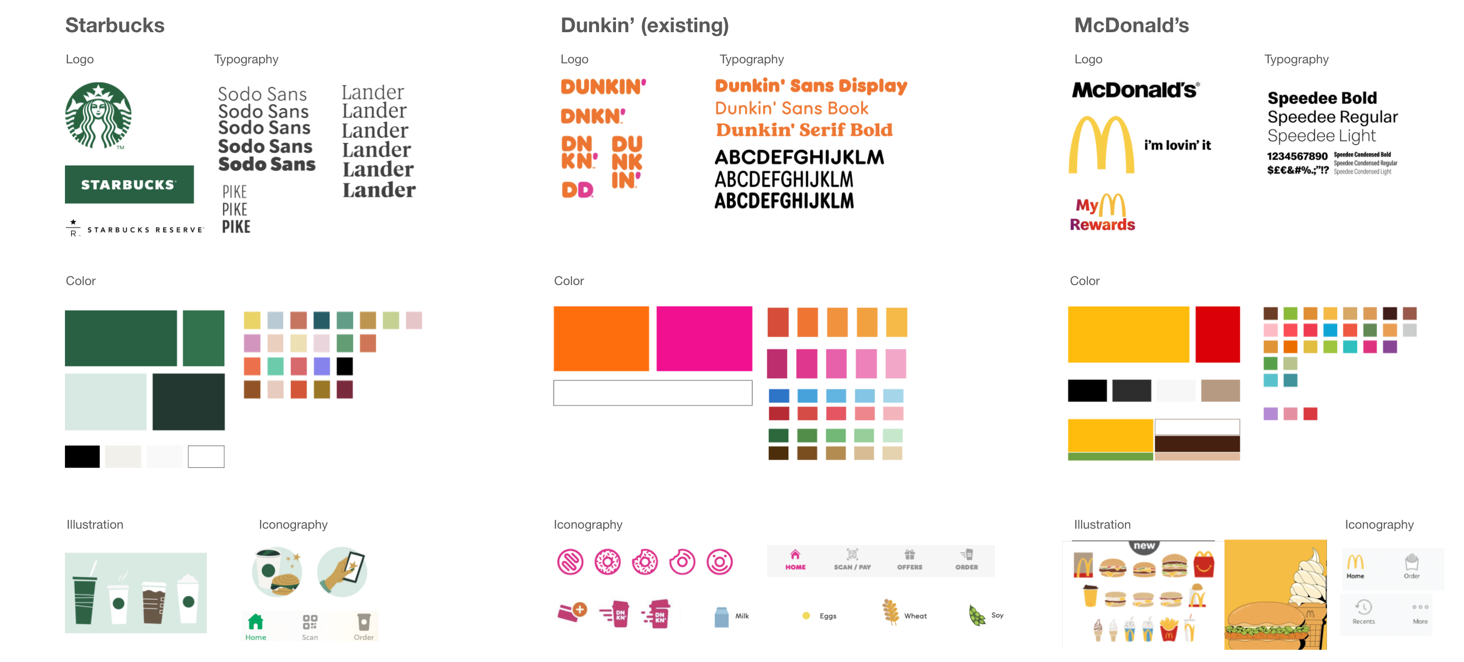
We began by creating a more purposeful logo suite that amplifies our equity without over-indexing on utility.

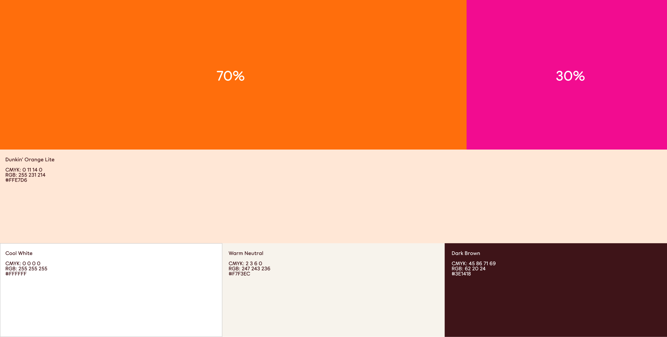
A revised classic orange and pink color palette leads with the orange to avoid clashing dominance between two colors.

A secondary palette encompasses a wider range of ownable colors for seasonal releases while maintaining the warmth and appetizing feel to Dunkin’s brand experience.
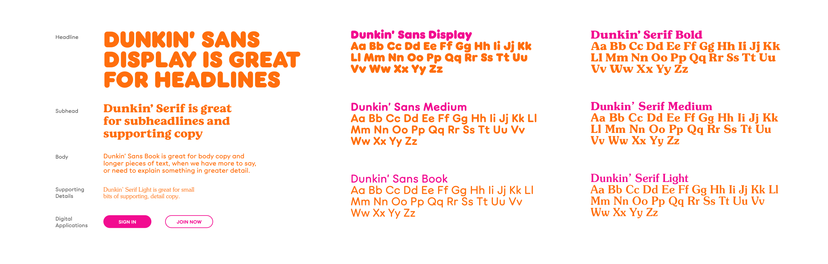
We moved Dunkin’s custom typeface forward with purposeful definition for both print and digital accessibility.

We evolved Dunkin’s iconography to be more ownable and have a clearly defined system for usage.


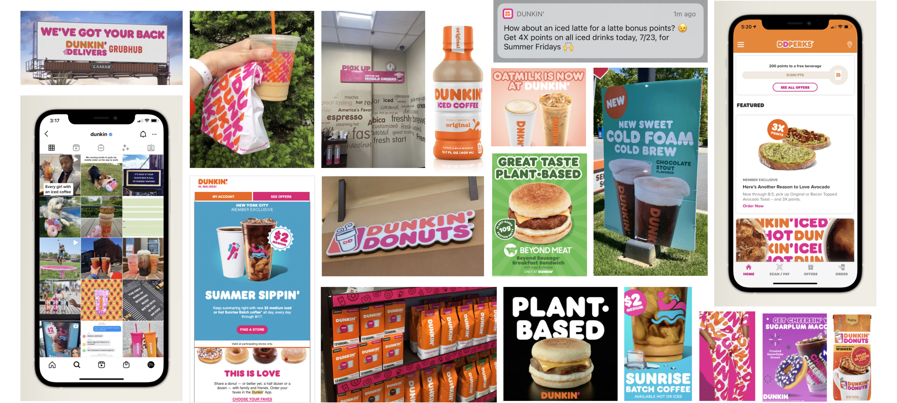
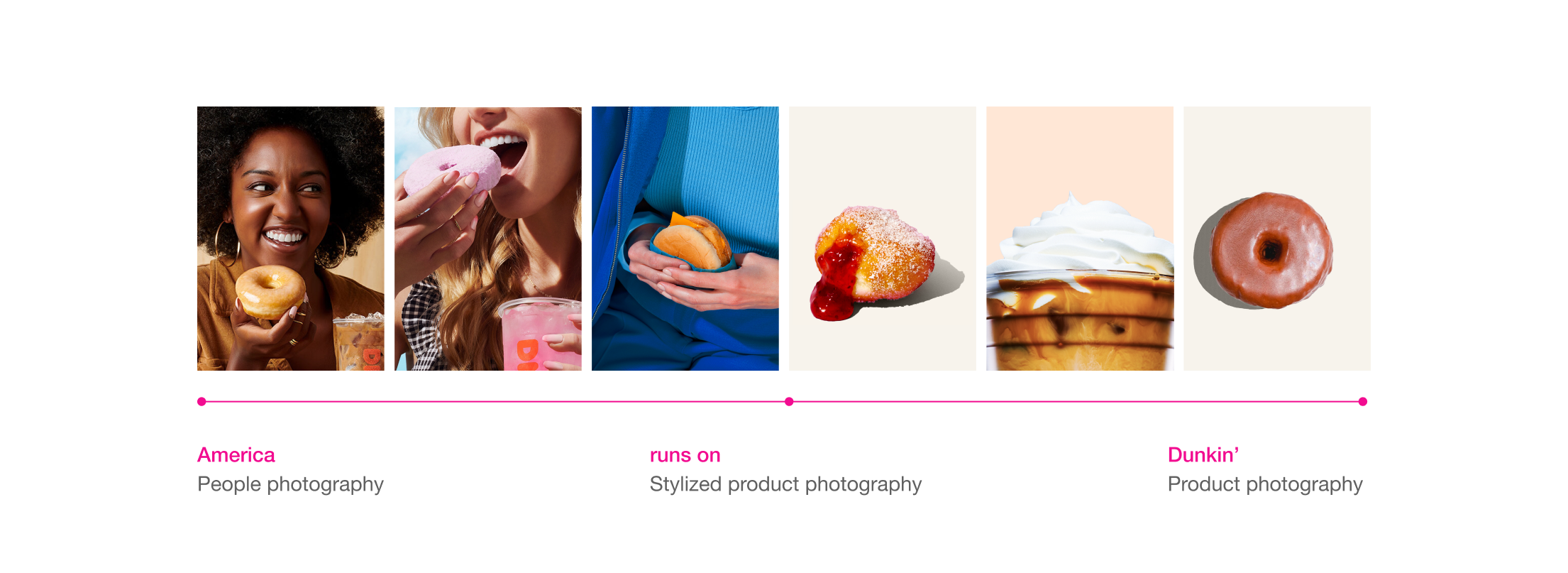
New photography guidelines infuse more humanity into their photography––through the lens of the products.

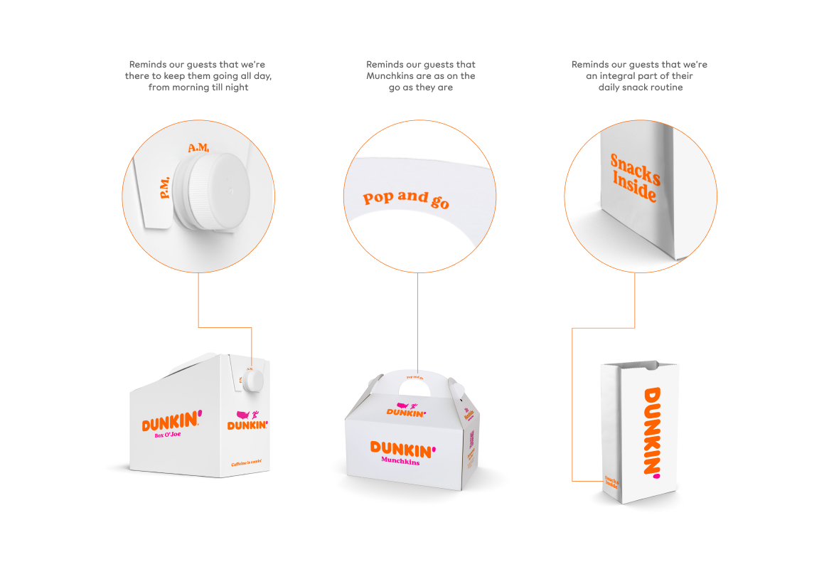
To bring it all together, we streamlined and simplified the elements at play in the packaging system, exercising control over the Dunkin’ brand line and tagline so their meaning remains clear.

Finally, we created guidelines to use the famous Dunkin’ pattern and apostrophe more sparingly, to truly maximize its energy and impact.

