Remotion 3.0
Re-branding for a startup redefining technical remote work
Remotion’s existing brand reflected its previous purpose- to be friendly and approachable as a social collaboration tool for remote work. With a new direction to design a high caliber video tool for engineering teams, this direction was no longer viable to represent Remotion. I lead a rebrand sprint to help Remotion present its refreshed mission to their design partners through a new brand and website.


Branding
Remotion’s new brand utilizes various elements of engineering workflow to ensure that the product fits right into the flow of technical teams.
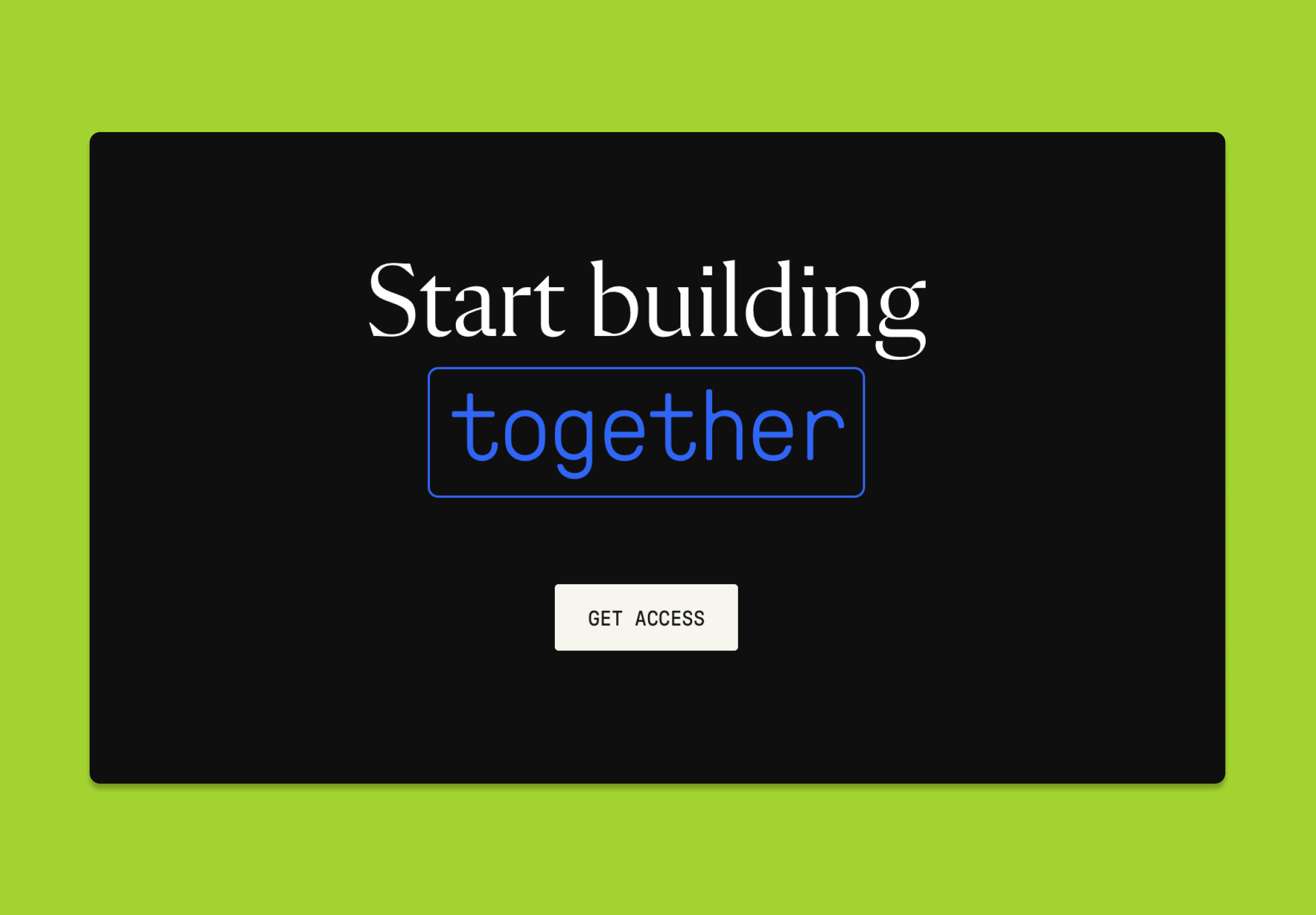
The typography leads with Flecha M, which both digital and readable with its angular serifs. The type stack is embellished with GT Pressura Mono, a monospace that is easy to read with its well-spaced and minimal serifs. Most of all, it provides the touch of code that our audience is most familiar with.
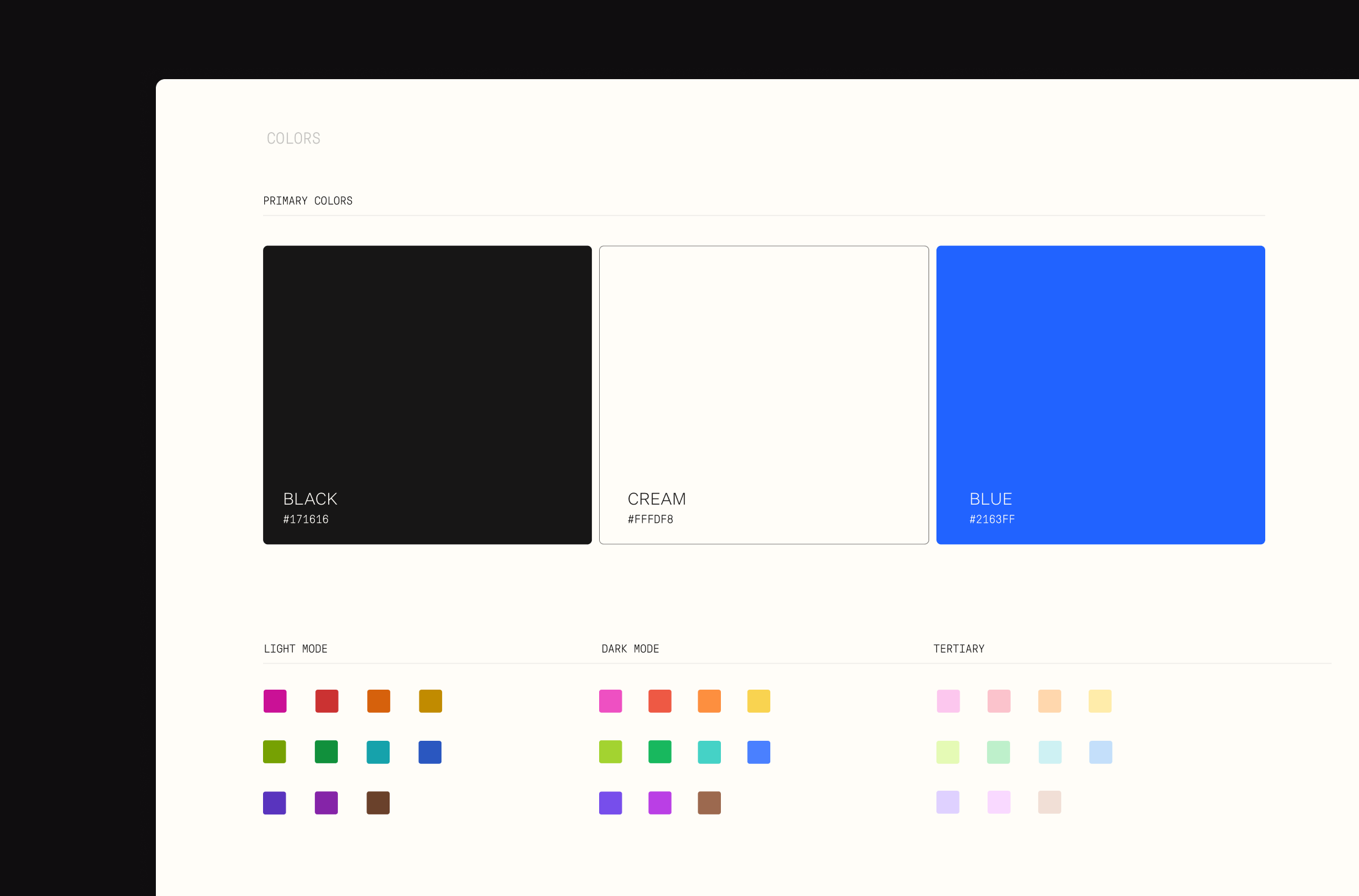
Remotion’s full color palette allows for accessible multiplayer usage in . both light mode and dark mode. Remotion’s key brand colors consist of a dark grey and a cream white that are inviting and easy on the eyes, accompanied by a bolder digital blue.


Minimalistic illustrations and graphics were created convey the dynamics and essential beauty of Remotion’s product in blog posts and change-log updates.


Website
The purpose of this website was to communicate the unique upcoming features of Remotion 3.0 and serve as a platform for design partners to keep up with the growth of the product through an dynamic changelog.


Other auxiliary designs continue to convey the thoughtful essentiality of Remotion 3.0.


